7 Rules in Proportion & Scale That Nail Your Interior Design
Dec 22nd 2020
A well-designed home does not happen by accident. When building or remodeling, many turn to expensive experts. Yet, it can be accomplished with some planning and basic knowledge. There are two common and important interior design concepts to consider: proportion and scale.
Difference Between Proportion and Scale
These terms are not always well understood, but they can make all the difference in contributing to your home's warmth and appeal. Scale has to do with the size of an object, how it fits in your space as well as with the other objects around it. Proportion refers to the shapes and patterns of these objects and how they all fit together.
What a Difference it Makes
We've all seen an overstuffed sofa in a small room or a rectangular dish on a square table. These settings aren't pleasing to the eye because they upset the balance of the room. Proportion and scale are two distinct design techniques that can help. Together they make a room feel comfortable and look beautiful.
Below are seven rules that can help anyone to design like a professional. If you're new to interior design, follow them. If you're more experienced, perhaps you can bend these rules, but never break them.
7 Rules to Follow
- Size: The bigger the room, the bigger the piece of furniture that can comfortably fit in it. The reverse is also true. A smaller room looks better with smaller, more delicate furnishings.
- The Golden Ratio: This also refers to visual balance, with a 60/40 ratio being ideal. Try not to cover more than 60% of floor or wall space. The other 40% serves a different purpose.
- Negative Space: This is that 40% that we referred to above, also called "white space." This allows the eye to rest in empty space and the whole area looks neat and ordered, not busy and cluttered.
- Furnishing: You should design the room around a central piece of furniture. A large dining room table sets the stage for the rest of the room design.
- Patterns: A large room can accommodate large and varied patterns with vibrant colors. While a small room generally works best with fewer patterns and more subdued colors.
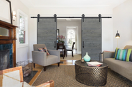
- Repetition: Repeated shapes and colors are pleasing to the eye and add to the balance of a room. Square coffee tables complement square windows just as rectangular wall art will compliment rectangular barn doors.
- Furniture to scale: A furniture piece needs to fit the size of the room. It also needs to fit the furniture around it. A large sofa would look awkward next to a tiny coffee table or loveseat.
These are the same rules that the experts use. It's all about following basic rules related to balance and repetition. Now you can too, and each room will look beautiful and make you feel right at home.
At Barndoorz, we have options for almost any interior design concept. Let us help you proportion and scale your next project and give you a functional room accent you’ll enjoy for years to come.
